[ads2]
Enable default mobile template
Eight build in mobile templates are already available on blogger platform. However, most of you might have seen only few of them. Just activate one of them and then you are good to go.
If any of them is activated, your that particular site will automatically render that mobile theme for mobile queries. So, whenever a mobile user will surf the site, a redirecting option will appear that will take him to the url- http://yourdomain.com/?m=1. Also, you can check your mobile site on desktop by simply defining the string as ?m=1 in the url.
Here is the way to do it:
- First, go to Blogger Dashboard > Template.
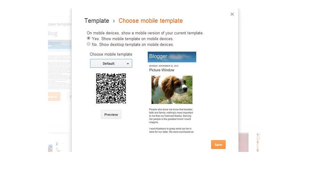
- Then click on gear icon for mobile.
- Then choose the option of showing phone template on mobile devices and pick your favorite theme.
- Finally, click on the save button.
Make your blogger template responsive
Responsive sites are much effective and better than separated phone sites. This is because, with responsive site, the same content is easily visible over different devices, but it’s not possible for a site with mobile theme.
Also, if you look from the SEO view, it’s good to select responsive themes. In fact, for every site and particularly for blogs, Google recommends responsive layouts. So, therefore it’s always in the best interest to make theme responsive.
It might be difficult for you if you are not a web developer. So, it’s better to go for a site developer. But if you have the basic knowledge of CSS, it might be easy for you to do it. Here are the steps to follow:
- Go to Blogger Dashboard > Template > Edit HTML.
- Add the following line inside the and
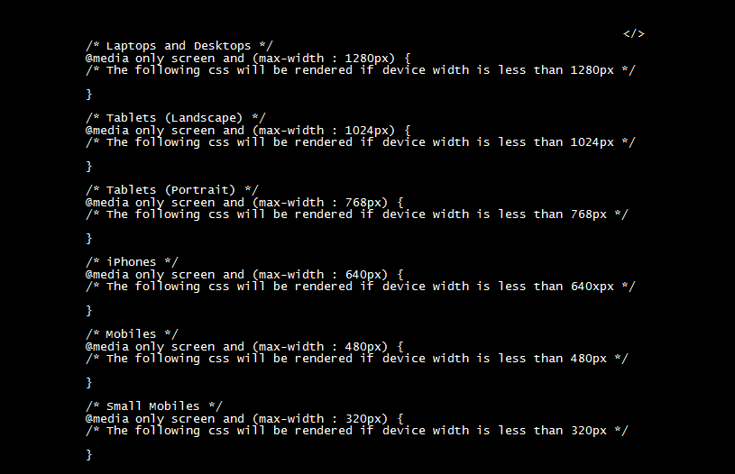
- Now, develop your custom CSS code for phone rendering and paste that in Blogger Dashboard > Template > Customize > Advanced > Add CSS. This code will render on mobile as well as desktop. So, we need to clearly identify that the code is rendered only in particular devices. For this , you will need CSS3 @media Query. The basic @media query CSS is:
- Finally click on “Apply to Blogs”.
- If you want that the width behaves according to the width, then you need to change all the main element’s width from pixel to percent. For example:
- If you find any unwanted scroll bar, make the use of overflow in CSS.


You can alter the width as per your requirements. Place your CSS for specific widths between the curly brackets. You just need to adjust the widths of the web page elements in order to make it compatible with all browsers.
Here are few tips to follow for writing responsive CSS:


Well, If it looks difficult for you to make template responsive , you have the options for using free or premium templates which are developed by the developers.
Develop an app for mobile devices
If you think that changing your site is difficult or not effective, then the best option to choose is to build an app for your mobile users. So they can have an amazing experience in reading and surfing your blog without any hesitation. It will not only boost your blog engagement, but you could also be able to make extra earnings later. I would guide you to go for an app if your blog is so much famous. Now, developing an app is actually a geeky work. You need to have much deeper technical knowledge for making an app by yourself. Even, I don’t have much knowledge about this to help you out. For this, you will need to hire an app developer.
These are some ways to make your blogger template mobile compatible. We can’t ignore this because people nowadays are getting engaged with the internet mostly with their smartphones and mobile. So it’s always better to make your blog ready for the mobile users.
If you know any other way, then do tell us and don’t forget to share your views through commenting.


