
[ads2]
A big question of discussion nowadays is whether to choose a separate mobile site or responsive web designs for the mobile handheld devices. Both options have their own pros and cons, but most preferred and widely used is responsive web design due to various advantages as responsive web design can handle both kinds of mobile users.
What is Responsive Web Design?
Before few years, businesses are developing separate mobile websites and user expects the similar surfing experience on smartphones, which they are getting on PCs, but now developing an effective online presence needs flexible and robust web design called as responsive web design.
A responsive web design is a stunning and simple website developed and designed in a way that all images, content and website structure remains the same for any devices either smartphones, laptop, desktop and other handheld devices. That means accessing the website on desktop with complete features can also fit to the small screens of tablets or smartphones with all that same features. Isn’t this great. So, this can only happen with the help of these responsive web designs.

Reasons Why Business Needs Responsive Web Design?
Here are some reasons why companies or businesses are looking for responsive web design services for their website:
Mobile Usage is Increasing
The usage of mobile is increasing day by day and this you can see with your eyes that people around us are always on mobile. However, there are companies or businesses yet to pick this market and trend. So, responsive web design helps them to do so.

Future Proofing
Responsive layouts make websites that are compatible not only to the desktop version but also to all handheld devices and smartphones currently available in the market and is a safe bet for a considerable time to come.
User Experience
Web site’s success not only depends on content but on many other things, one of them is user experience. Optimizing and enhancing user experience for any device can be easily done with responsive web design. No resizing – No scrolling is needed for any visitor who accesses your website from any particular device.
Highly Flexible
Responsive layouts create fluid websites which means images and content fits easily and move freely across the every type of screen resolutions. Here both contents and grids are fluid. The responsive web design brings back the look and appearance of the website on any device screen.
Recommended by Google
With the new mobile algorithm, google highly recommends responsive layout. If a website is not rightly visible in handheld devices, bounce rate increases, which clearly means unhappy visitors. These responsive layouts also make it easy for the users to link, share, interact from single website then separate website. So it’s also good from both SEO and business point of view.

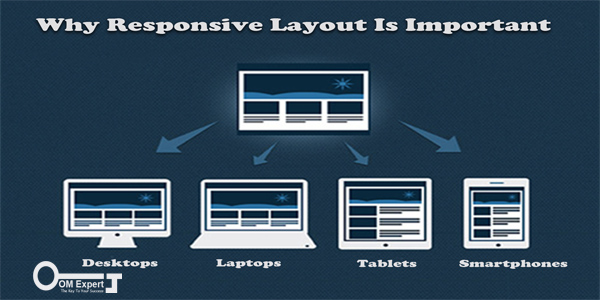
One Website, Many Devices
One of the best reasons to have a responsive layout is you just need to have only one website and that will work on each and every device whether it’s mobile or desktop, doesn’t matter! Responsive layout is compatible with all screen resolutions as discussed above in the User Experience category.

Easier to Manage
Separate websites mean each and everything would be separate including promotional strategy, marketing campaigns and other technical and management work. Now, let say if you are running a small or local business, just imagine how much headache it would be for you to manage all these things. Whereas responsive layout will help you to manage easily with single website.
Improve Conversion Rates
Responsive layout services help in building a consistent and optimized website with a good user experience. With this, it’s more likely that the users will get engaged more with your website and avoid going to any other website or somewhere else. So, both sales and conversion rate improves.
Cost Effective
Responsive layout allows you to follow a unified approach for upgrading websites, promotion, website management, support and maintenance. This enables you to allocate single budget for your single website. So, that not only saves cost but it helps a lot in saving your effort and time.
Stay Ahead in Competition
In every type of business you require to reach more potential consumers to make them aware about your site, help them to buy from your site or offer services they are looking for. If they are on mobile, there are chances that your competitors are already trying to reach to them. However, via this responsive layout you can overcome this challenge and also, this will put you ahead in the competition by reaching more and more potential consumers.
A Key Feature of the Responsive Web Design is Convenience
OM Expert is a well recognized responsive layout company which believes that the responsive web design is the most necessary and foremost thing for every business. OM Expert provides stunning responsive layout services in a way to optimize user experience that will bring more traffic and hence more potential customers. Contact us for more information and we will be happy to help you.